Hiroshima, Mon Amour Poster Analysis

Hiroshima, Mon Amour was a 1959 French film directed by Alain Resnais. It’s one of my favourite films, and highly influential in world cinema: it influenced the later French New Wave with its nonlinear storyline and its innovative use of flashbacks. Moreover, it’s just a lovely film about the shortcomings of memories and dealing with personal– and not personal– tragedy. The original poster was designed by Boris Grisson, a prolific Russian-French designer who designed over 2000 French film posters.
Colour
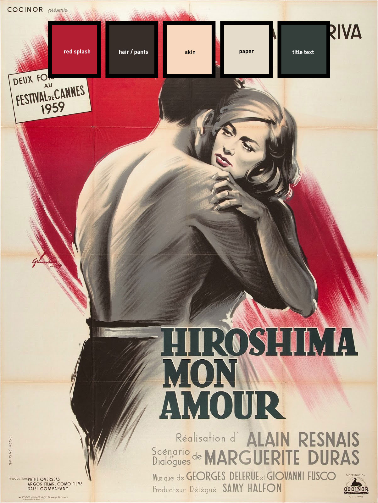
Grisson’s posters were designed to be printed as lithographs, a printing technique in which the artist etches several stone blocks (using oils) and then flat colour is applied to the block, which is then used to produce a print on paper. Each colour would have its own stone block (or else would be applied by hand); consequentially, many lithographs have limited colour palettes. This poster is no exception to this. Although I have highlighted five separate colours here, it is more likely that only two or three inks were applied to this lithograph: a red, a black, and perhaps a soft peach (the brown is likely produced by combining the red and black.)
The overall colour scheme is soft and evokes melancholy; a perfect fit for a film about memory. The red invokes passion and the idea of love.
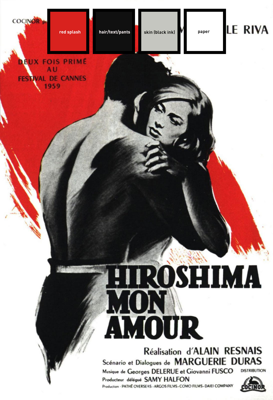
This poster is also effectively produced using cheaper printing techniques; here, the print is cheaply created using only two types of ink: red and black. This variation is effective in its own way: the strong red on the white paper looks like the Japanese flag, and also looks like a splash of blood.
Typefaces
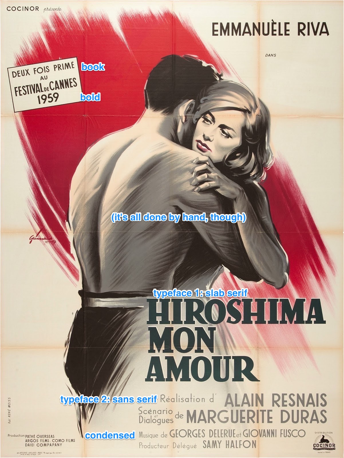
This poster was created before even phototypesetting was popular, so the letterforms aren’t very consistent– it’s hard to identify what precise typefaces are used here. The type was likely traced, cut out, or stamped by hand. What is clear is that there are two typefaces used: a slab serif for the title, and a geometric sans-serif for all the other copy. The first is used sparingly, with only one bold-weight variation. The latter appears as both medium and bold weight and in condensed and regular forms.
Grid
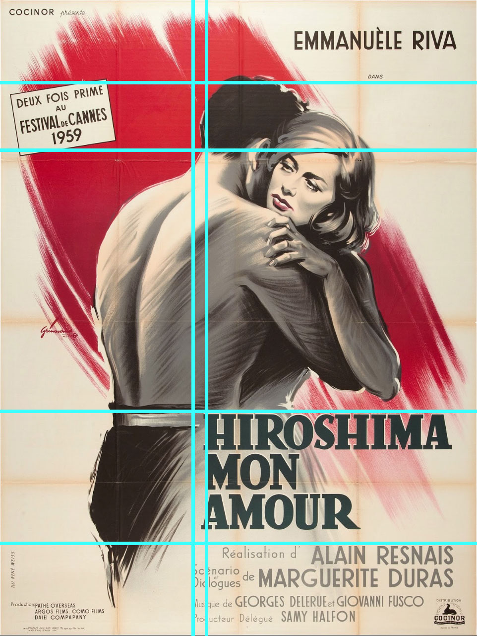
In all honesty, a grid was likely not used in the design of this poster. The main image is painted, and there isn’t a lot of typography; the grid was primarily used at the time for things with more copy or from stricter schools of graphic design. That isn’t to say there isn’t alignment and order in the image; the title was likely aligned with the back of the man’s head and the top of his pants; the addition of the top left box (that proclaims the film a two-time winner at Cannes) is aligned with his hair.
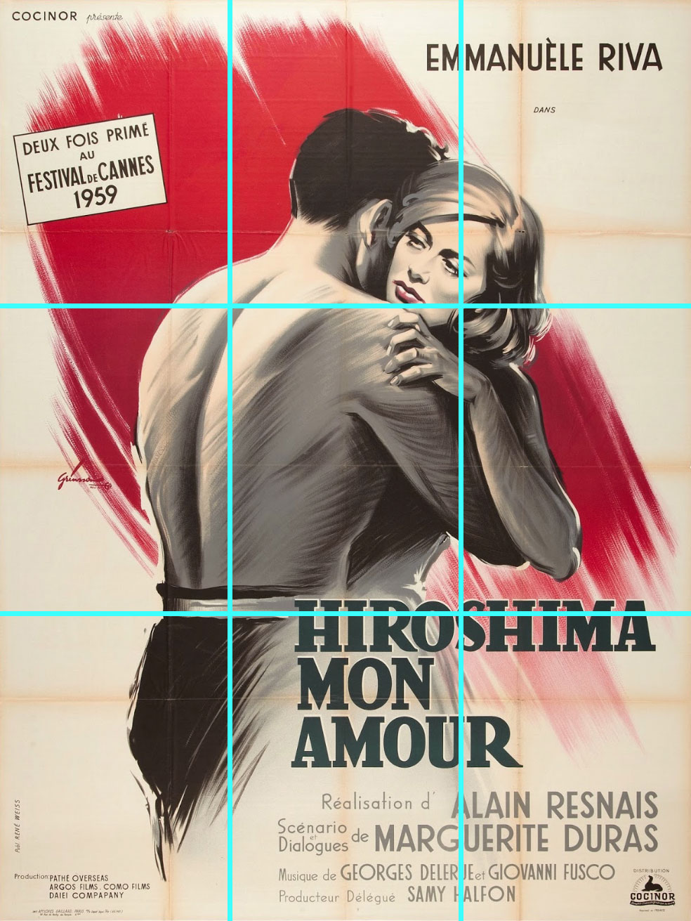
The rule of thirds applies, more or less, though. The woman’s face and the title are placed at thirds.
Visual Hierarchy and Whitespace
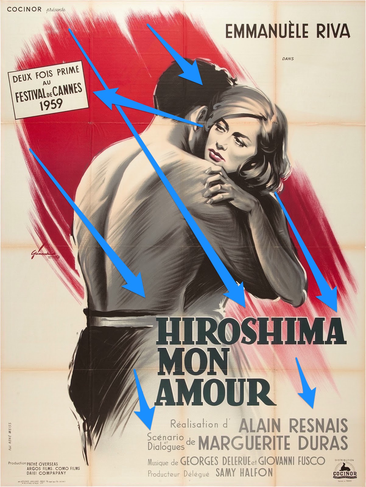
The red splash in the background directs the eye. Without it, it would be harder to determine the positive space’s visual hierarchy; the whitespace is otherwise a bit formless. The splash directs you from the top left corner to the couple at the center and then finally, the movie’s title and the credits copy. A separate hierarchy occurs with the woman’s gaze and the award-touting box. You start at her gaze, and it drives you towards the left and the box.
Overall, the poster creates a compelling story of Japan, melancholy, and a hesitant couple. I think it’s fairly effective design.
Subscribe via RSS