Let's Get Down to Business
I have three confessions to make, dear blog readers, about my Visual Language assignment. The first is that the night before it was assigned, I essentially finished it. I wasn’t aware it would be assigned the next day; I just thought that I should make myself business cards. The second is that I just made some quick edits to it to meet the assignment’s criteria for submission. I didn’t redo the assignment; it felt like a waste. The third confession: I don’t like the adjustments I made, and I wish I kept my original design before sending them to the printers.
Background
One of the most important factors in the design of my business cards was the redesign of my portfolio and blog. When I started ITP, I knew I would have to redesign both: I failed to update them in years, and class after class emphasized to me that the blog was a central part of ITP. I also wanted to move my blog to the ceiling.cat domain, a novelty domain that I’d owned for years but had done nothing with.
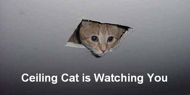
If you were an internet nerd in the mid 2000s, you’d probably remember this meme.
Another thing I wanted was to have matching but separate identities for both websites. The portfolio was serious, and meant to showcase my best work; the blog was for works in progress and silly thoughts from ITP.
I also wanted the blog to have a logo with a cat. It didn’t make much sense to do otherwise.
To summarize: I wanted to have a logo template that would work for a serious portfolio as well as a cat. That’s a bit of a tough briefing, but it’s aided by how the original ceiling cat appears: he pops out of a square hole in the ceiling.
Consequentially, I can start with a square template for both logos– it’s clean and professional for my portfolio, and appropriate for ceiling cat.

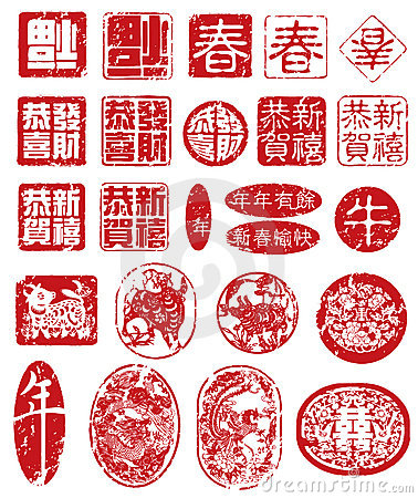
I decided that I wanted to subtly evoke stamps and Chinese seals– it’d reflect my heritage and help give the logos a unified idea. I rounded the corners and decided that the logos would be single colour, as if they could be stamped on. Then, I could convert them to black and white, any colours, or even add an image to the logo.
This is getting a bit long-winded, so I’ll spare you more details about the logos. Suffice to say, I drew a bunch of cats, and tested a bunch of typefaces, and came out with the following two logos.

The Original Design
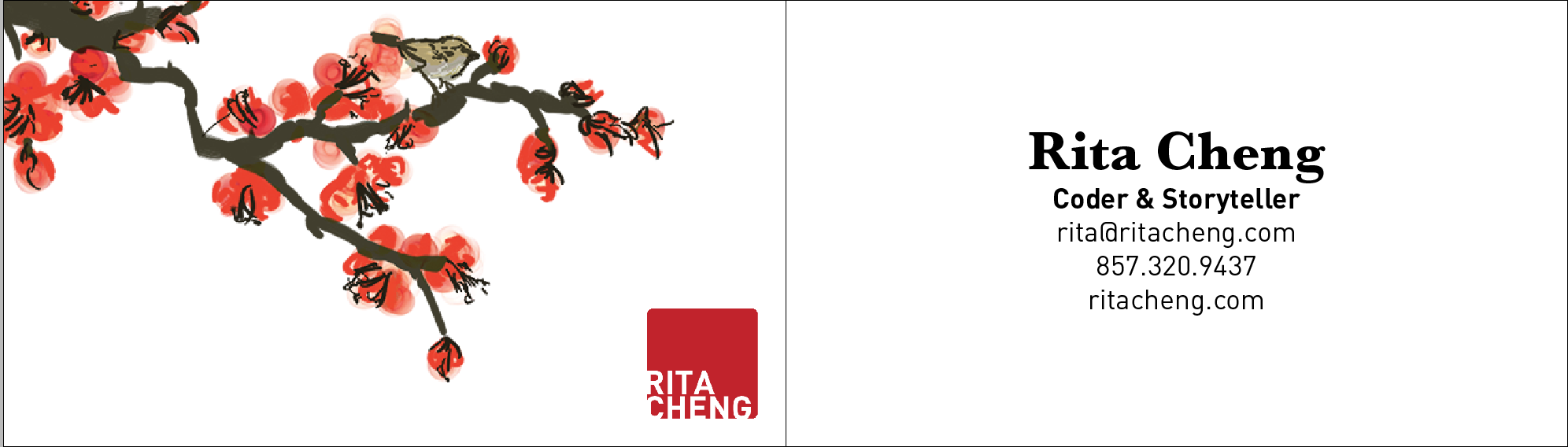
With this starting point, I decided to make my business cards on Sunday. Given the ‘chinese seal’ design element, I decided to take scroll paintings as inspiration, and drew a digital watercolour painting of a bird on a cherry blossom tree. (My street in Vancouver was lined with cherry blossoms, as many are.)
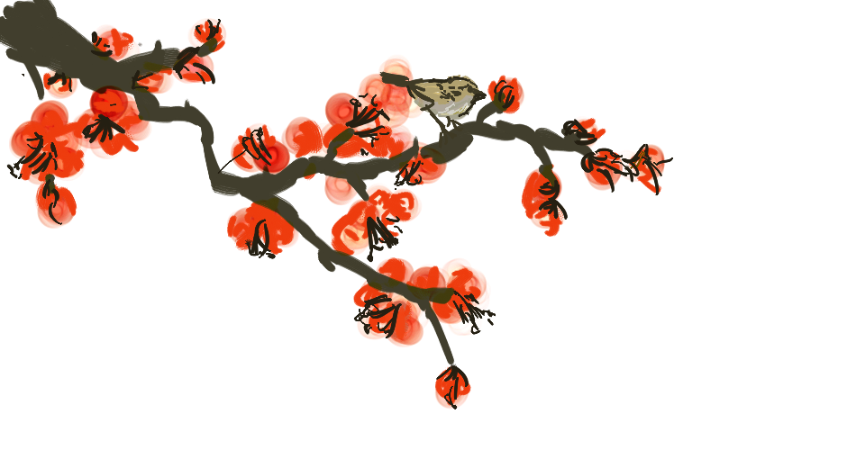
The painting’s focal is from right to left, as most Chinese scrolls are, and I consequentially placed my seal and my information on the left of the card.
I finished at this point, and then the next day I went to class. I received the assignment, and changed things for the worse.
The Redesign
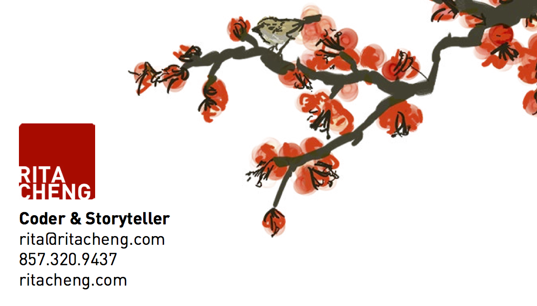
The most consequential change was that the assignment stipulated that the card had to be double sided. I originally tried making the painting go across the two sides, but the image was too low-resolution to print at this point.
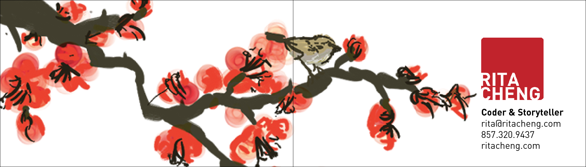
I then decided to stick with the image on one side, and just moved the information to the back. I also flipped the painting, because we discussed in class how the lower left corner was the weakest focal point of an image (which, in retrospect now, is less consequential in a landscape business card with its low height.)
I sent this image to the printers, which I terribly regret. In retrospect, landscape business cards are too short for that focus information to matter, and images always look better before they’re flipped (unless they are perfectly symmetrical.)
Additionally, it’s overall a stronger design on only one side. I also regret the serif font I chose on the back– I thought it would provide a nice contrast, but it just looks out of place.
Overall, I wish I kept my original card. But you can keep this analysis in the meanwhile.
Subscribe via RSS