Everything is Connected
Honestly, I wish I could say that I created an extremely thoughtful data map for Everything is Spatial, but the output ended up being entirely shaped by the datasets that were available from NYC OpenData. A less discussed aspect of making data available for everyone from the government is the cold fact that some of this data isn’t very useful to people outside the agencies. For my work today, this isn’t a matter of what the contents are or why I should care about, but the truth of formatting and complete data. I could hardly find any use in a compilation of farmer’s markets if every latitude and longitude listed was rounded to the nearest whole number. I’m pretty certain most NYC farmer’s markets aren’t in Jersey.
I ended up, instead, mapping out LinkNYC and used a custom icon– the idea was that these hotspots are tourist’s destinations and centered around tourists’ areas. Consequentially, a point of interest icon for a LinkNYC was likely to point to an actual point of interest. That’s the idea, anyways. Here’s the map: https://api.mapbox.com/styles/v1/zelara/ciznkp1yr002t2rqk1goyzyac.html?title=true&access_token=pk.eyJ1IjoiemVsYXJhIiwiYSI6ImNpejRqcTM3dTA1NmgycXA4aG9sMThwOWQifQ.IgjTacT5vhTj5Zzitd_rQQ#9.6/40.787107/-73.782926/0
For my QGIS map, I created an extremely patriotic map of Canada. There are so many rivers abound, and it’s so tied up with the mythos of the fur traders, that I was playing with the idea that rivers are the ‘blood’ of Canada. In the end, though, I reversed the colours of land and rivers, so it’s more of a flag tribute than anything.
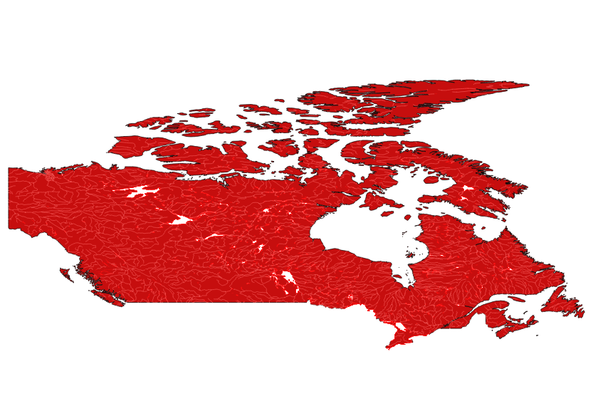
This projection of Canada really bugs me, in ways I never anticipated. I thought I’d like non-Mercator projections more. Is there a way to change projections easily in QGIS? More research must be done.
Subscribe via RSS